← Back / Work
Case Study: PoEdit
Improving customer acquisition through meaningful product presentation.
Overview
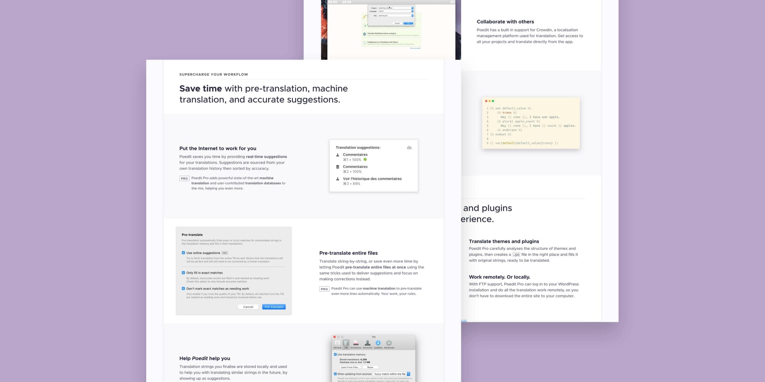
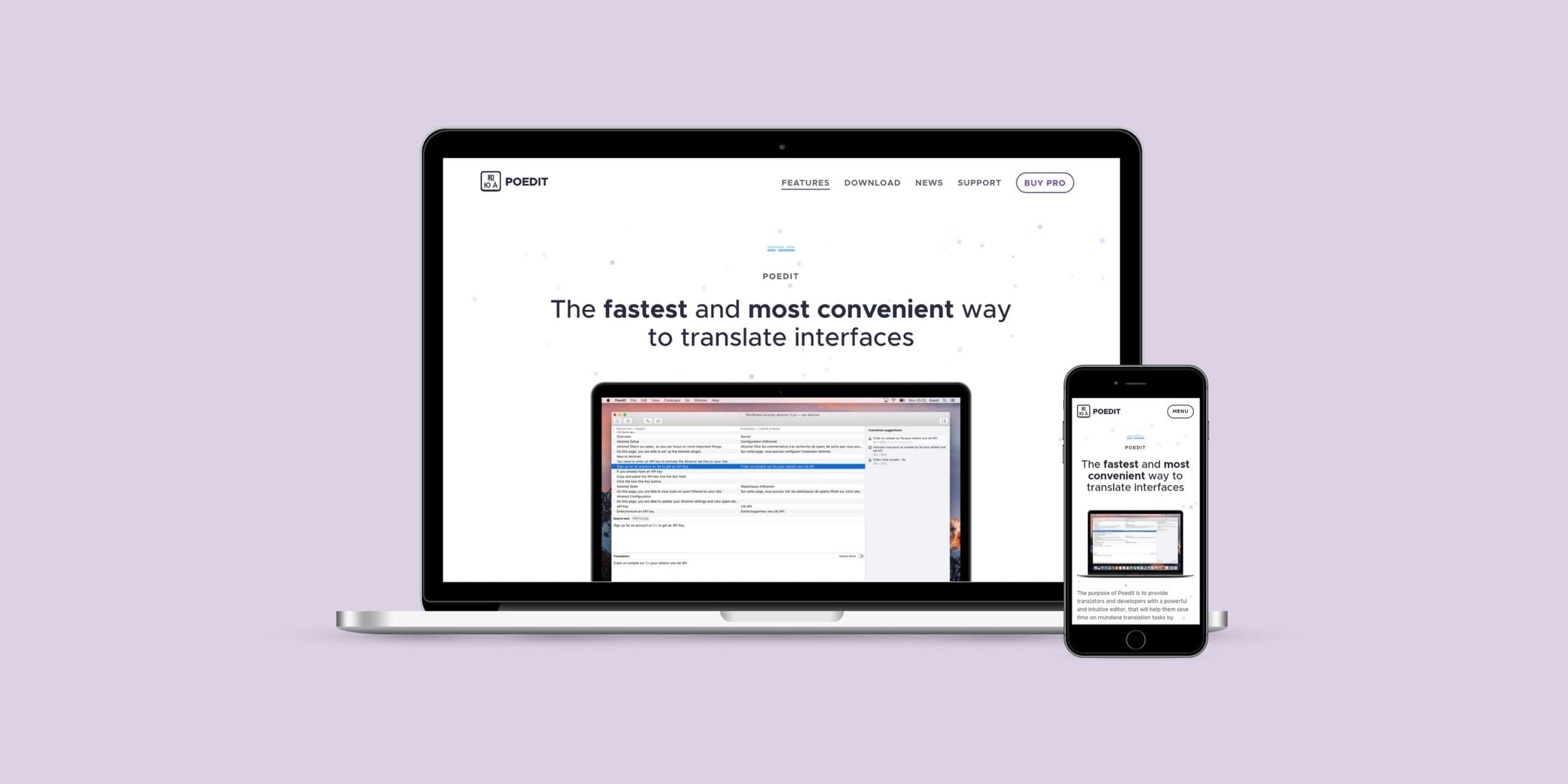
PoEdit is a multi-platform desktop app for translating apps and websites, with over 60k of monthly active users. We were asked to update its marketing website to better articulate the core value proposition and as a result improve its baseline conversion rate.
Methodology
Thanks to a diagnostic approach we uncovered how to better qualify leads and convert them into paying customers, by funneling prospects to a landing page made specifically for paid upgrades.
The updated content and overall design did a much better job at selectivity, by focusing on two core audiences: professional translators and software developers.
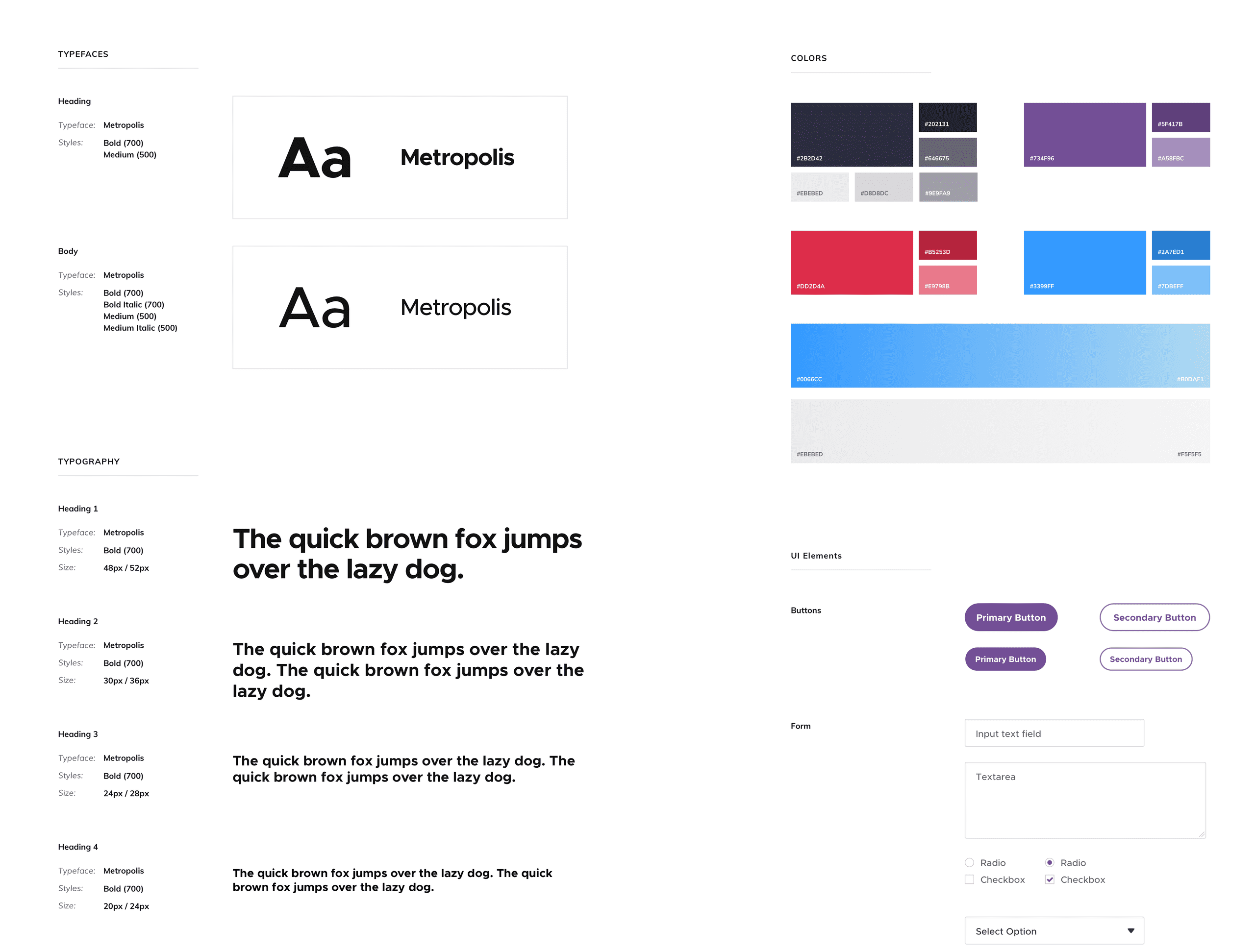
As maintainability was a key focus, we delivered a cohesive design system and style guide, to help the client continue producing accessible content in line with the new look and feel.
Project Scope
- Redesign with a particular focus on customer acquisition.
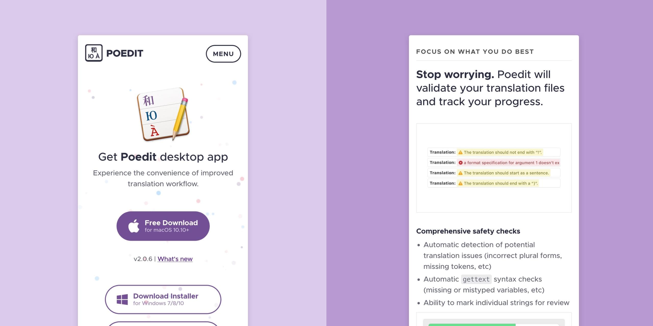
- Provide a better mobile experience via responsive web design.
- Optimise experience to facilitate download and purchase actions.
- Remove technical debt with a modern, maintainable codebase.
Focus
User Journeys, Copywriting
Platform
Web, NodeJS
Deliverables
Strategy, Concept, UX, UI
